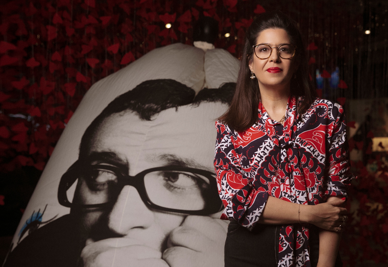
A conversation with artist and designer Guy Saggee whose unique imprint is evident in all of Design Museum Holon’s printed products in the past four years.
A conversation with artist and designer Guy Saggee whose unique imprint is evident in all of Design Museum Holon’s printed products in the past four years.
What are “Greenfeld” and “Schwarzbrot” doing in an exhibition about Mizrahi Jews? asks Guy Saggee, and answers with two posters featuring a hybrid he created and calls “The Black Ashkenazi”, who cannot comprehend “Mizrahiness” other than from his own “Ashkenaziness”.

The Black Ashkenazi – finger in the eye, pushy, the perpetual underdog even when he’s got the upper hand. Employing a geometric blend and camouflage patterns, blurring and blending in the Levantine space, Guy Saggee creates his interpretation of “Mizrahiness”. (The Mizrahis, an exhibition curated by Amnon Illuz, Holon, 2013).

Not surprisingly, the two posters share similar landscapes with those of the Common Roots exhibition catalogue, the last catalogue Saggee of Studio Shual designed (together with designer Maayan Levitzky) for Design Museum Holon. After seven catalogues, thirteen exhibitions, innumerable invitations, advertisements, brochures, exhibition spaces, and accompanying texts, we met for a chat to sum up.
 Double page from the Common Roots exhibition catalogue, Design Museum Holon, 2013
Guy Saggee, who has been accompanying the Museum from the very beginning, is largely responsible for the positioning, definition, and construction of a unique language for a new cultural institution that in a short space of time has managed to position itself on a par with leading cultural institutions in Israel and around the world.
In a series of catalogues, which while they are different from one another, evident in each of them is a wise and guiding hand, unique inventiveness, and extraordinary complexity, together with his studio coworkers he has managed to create a unique and distinct language for the Museum.
We went back to the early days.“In early 2009, Adi Stern invited me to build the Museum’s language with him. The logo was in its initial stages at the time, and the question was how does a catalogue function within the new language? On the one hand we had a desire to create a catalogue that stands on its own merits, and on the other a need to connect it to the Museum’s language.
Another question stemmed from the need to create a bilingual catalogue: English and Hebrew – how do you connect the two languages, and not in the way it’s usually done in Israeli catalogues where Hebrew is always the secondary language. In these catalogues, the English runs from the end, in the opposite direction to the numbers, so that when you leaf through the catalogue the numbers go from high to low. And in many places you had to refer back twice – so they were inelegant solutions that created odd encounters between the languages. Frequently, you got to the middle of the book and realized you were at the bottom of the English. So we decided it was to time to propose a different solution, and we contrasted the languages by 180 degrees.”
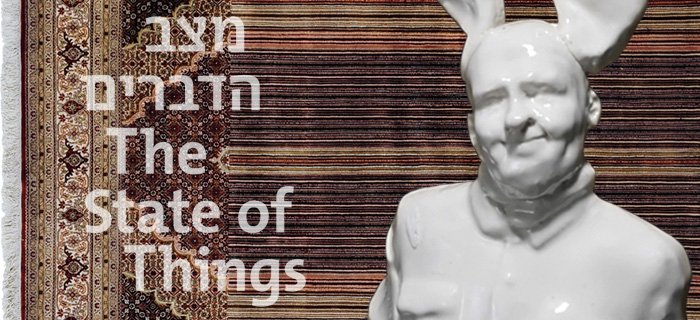
 The first Design Museum Holon exhibition catalogue designed by Guy Saggee for The State of Things, 2010
You’d never done it before?No, and so far I haven’t come across this kind of solution anywhere else either.
Not in other languages either?I’m not absolutely sure about that, but in Israel I’m sure there isn’t. It may well be that designers have thought about this solution but haven’t implemented it. Although it’s an almost obvious solution it’s still quite radical – you have to turn the book upside down to read the text, and when you look at the page you’re constantly seeing another language upside down.
 From The State of Things exhibition catalogue, 2010
It can be quite distracting…True, and that’s one of the disadvantages of this approach. But it has a lot of advantages.
So the advantages are that you managed to solve everything you noted was a problem…The advantages are that the book has a beginning and an end. It has real numbering, and the reference pictures are shared. It has the rhythm of a real book. All you have to do is choose the language once. Neither language leads. In the first catalogues, the image led the direction, but then we decided that the typography would be the heart of the matter. It’s an almost indifferent approach. You simply turn the book in the direction of your language, and start reading. This design solved the two questions we asked earlier about the relationship between the languages, and the uniqueness and identity of the Museum’s catalogues that would be independent and also have a language of their own.
Okay, but how does that link them to the Museum’s language?The link to the Museum’s language is achieved through the logo. In the first catalogues we tried to play with the Museum’s fonts, and then we discovered that it’s better to leave the design completely free. The logo has to be the backbone of the catalogue and in a uniform size. Sometimes we create an image that’s associated with the Museum’s language, but all the rest is free.
So, ultimately the decision was not to hermetically link the catalogues to the Museum’s language?Yes, when Senseware came along, which was the second exhibition, we understood that we’d have to contend with exhibitions that come with a language of their own that has nothing at all in common with the Museum’s language. So we decided to create completely independent catalogues that would have the Museum’s imprint and the perception of the seriality of the languages. In this way, each catalogue solves the problems and relationships in the language most suited to it.
In The State of Things exhibition catalogue there are two languages on the same page, but in Mechanical Couture the languages appear on separate pages. So in every catalogue we solved the problem according to the format and convenience of reading.
 From the Senseware exhibition catalogue, 2010
And you didn’t feel at any stage that there should be greater uniformity between the catalogues?No, I’m totally satisfied with it. It looks right to me. We built a language from the foundations for an institution that hadn’t previously existed. So every exhibition was different, and the catalogues were made to suit the exhibition, not each other.
On the other hand, if you want to build an image, what kind of image do you build with a non-uniform language?When we looked at catalogues in 2009, we saw that in all the museums around the world there’s no uniformity. The uniformity is mainly created by the logo. The Museum’s identity is evident in its advertisements, posters, in its various internal distribution means: tickets, invitations, brochures, all create this uniformity. The advertisements are the Museum’s window outward, and in them and the catalogue covers it was important for us to maintain the language. But even in them there’s a difference between touring exhibitions and original exhibitions. Actually, if we were a twenty-year-old institution it would have been less of a problem, we wouldn’t have been so preoccupied with it. But I believe it’s not the most important thing in the world. Versatility is important, it’s important that the Museum works, and adapting to what the Museum needs, and once in a while to manage to bend its rules.
 Cover of the Common Roots exhibition catalogue, 2013
As we know, the work of design is full of compromise; which catalogue in your view enabled you to work within the constraints but compromise the least?I think it was the first (The State of Things) and the last (Common Roots). It’s about what came out in the end. The Common Roots catalogue had a lot of conditions and restrictions attached to it, and I felt that despite all the limitations and budgetary constraints, we produced something I’m very pleased with.
I think the spirit of the catalogue’s design is very much in the spirit of the exhibition…The whole of the last exhibition was altogether something special. We’ve finished working here, and it’s great to end like this, and the catalogue and the index and the advertisements and the exhibition itself were a great, wonderful, special last opportunity despite all the stress. But the Yohji Yamamoto catalogue also came out well. In spite of all the complications and constraints, the catalogue was a success. So what’s the conclusion, that complications and constraints produce good design?
 From Yohji Yamamoto at Design Museum Holon exhibition catalogue, 2010
Necessity is the mother of invention? Could be. But let’s talk about something else. Both you and I have read what Mushon Zer-Aviv wrote about the future of catalogues. What do you think?I think he’s right. But he was talking mainly about art catalogues, wasn’t he?
No, I think he was referring to catalogues of any kind. He eulogized catalogues, said they were overvalued, that they’re published at an exorbitant cost, and people can’t afford to buy them. There’s no difference in them between art and design.True, the debate began in the art world, but he’s right in what he’s saying. There are new means of expression and new means of communication.
Do you also think catalogues should be taken off their pedestal?Those are his words, not mine. But I do think we need to find new means of expression in the digital world. I’m definitely interested in it, although I haven’t yet seen anything of this kind that’s been done well.
I’m not arguing with his ideas, and its important to discuss them – who are catalogues intended for? We discuss this extensively in our meetings. But I am arguing with his conclusions – we don’t have to immediately announce the demise of print.The demise of print is something huge that we can’t contend with. But there’s the fact that producing good content costs money. And design will have to be done one way or another – in material or pixels. In any event it has to be cracked, and in the case of digital catalogues you have to create something that doesn’t exist yet, but on the issue of distribution, as Mushon stated – it’s much more practical financially.
 From the Yohji Yamamoto at Design Museum Holon exhibition catalogue, 2013
Do you see yourself designing catalogues for the internet?Definitely, but it will require retraining, learning it, and trying to find solutions for these things. But one more word about the word ‘catalogue’, I have to say that I make books, not catalogues. Although they’re associated with an exhibition, they are books in their own right, and they don’t aspire to photograph the exhibition and put it in a book. They contain content that the exhibition doesn’t, and there are relationships in its elements that aren’t associated with the exhibition. It’s a book – a multilayered book. It has images and articles, and it has additional pictures, and it doesn’t catalogue and present the items in the exhibition. This can be implemented in the virtual world as well.
Who is this book intended for? Who is your ideal reader?Me. You know, Design Museum Holon’s catalogues are catalogues for designers and design enthusiasts. Few are the people who aren’t design aficionados who will buy catalogues.
Why do you think people in Israel seldom buy catalogues?Culture and money.
But the same people will go abroad and buy catalogues in other countries, but not here. Why?I guess because it’s like bringing home a souvenir.
Do you think it’s important to publish catalogues in Hebrew in Israel?No question about it.
Why?Because if we don’t, then it’s not worth publishing a catalogue at all. That’s one of the best reasons to publish a catalogue. There are very few people who need to research, and a few who’re interested in what or who was in Israel before. It creates a foundation for culture.
 From the Mechanical Couture exhibition catalogue, 2010
So why not just in English? People can read about what was here in the past in English.Because it’s connected with preserving our language. Wherever you go there’s “Dallas Falafel”. We can also walk around with parasols and walking sticks. But it’s not local, it doesn’t belong. I’d do away with the English before relinquishing the Hebrew. If we stop with that, then we can stop translating literature as well.
Where does your great love of language stem from?In the end you fall in love with it. Originally, I wasn’t a graphic designer at all. When I graduated from Bezalel I was an artist, an illustrator, I didn’t engage in typography at all. I didn’t have any understanding on how to approach language. But I fell in love with it, with the shapes of the letters. Maybe because I had a grandfather who was a linguist who used to teach me the letters, he’d sit with me and we’d make serifs. Maybe that’s the source of my love of the language.
 From the Common Roots exhibition catalogue, 2010