The way a font is designed holds special importance in the Hebrew language. By its very nature the Hebrew letter is not easy to read, there are but few differences between the lett
Letters – small works of art that possess broad meaning – are symbols that we take for granted. This was articulately described by Henri Friedlaender who said that a clear identifier of the character of contemporary culture is our attitude towards and everyday usage of objects, the nature of which we do not know, such as electricity, radio, diesel – or letters, which we all know how to read and even write in one form or another, yet how many of us are familiar with their internal rules?[1]
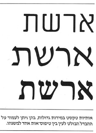
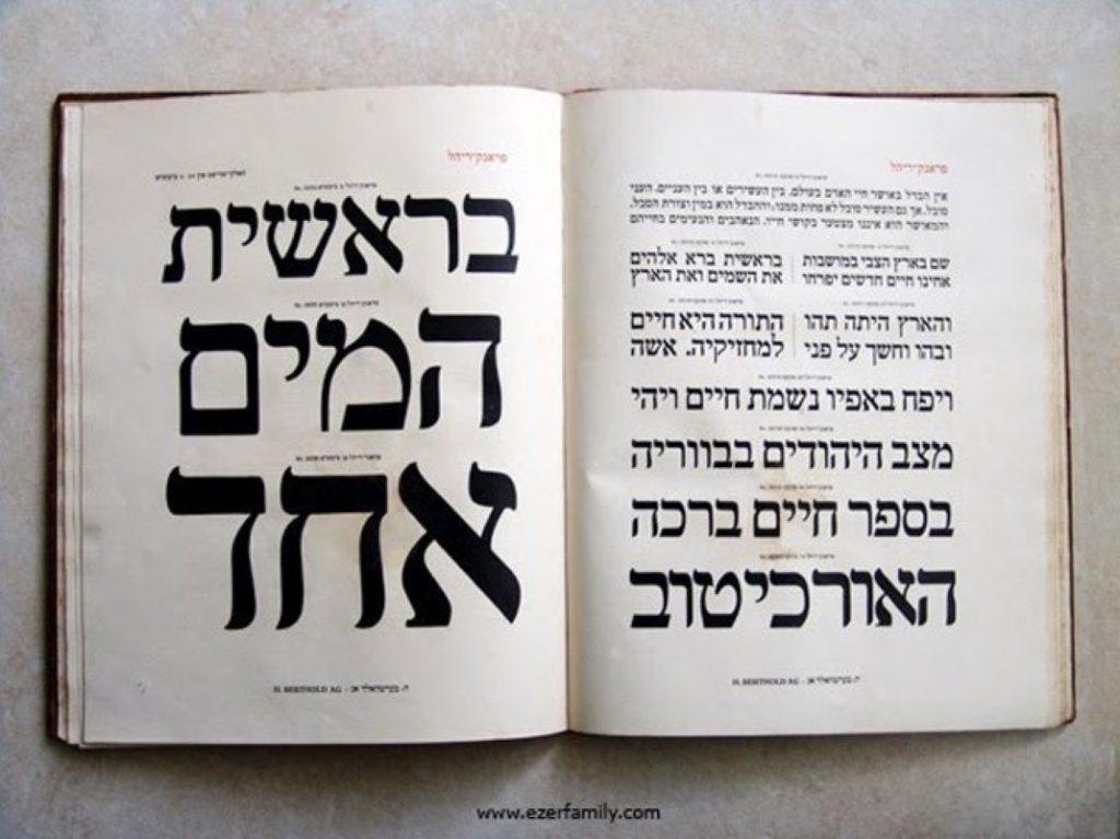
The way a font is designed holds special importance in the Hebrew language. By its very nature the Hebrew letter is not easy to read, there are but few differences between the letters, and oftentimes the reader identifies the letter after reading the whole word. One of the principal reasons for this stems from the square form of the font. The only Hebrew letter that extends above the line is lamed (ל), and the letters qof (ק), final kaf (ך), final nun (ן), final peh (ף), and final tsadi (ץ) extend below it. The reader sees a cluster of squares that are difficult to distinguish from one another. The difficulty also stems from the fact that about two thirds of the Hebrew letters resemble “sister letters”, such as heh (ה) and het (ח), bet (ב) and kaf (כ), dalet (ד) and resh (ר), gimel (ג) and nun (נ), vav (ו) and zayin (ז), and samekh (ס) and final mem (ם)[2].A study conducted at the University of Haifa on the readability of Hebrew and English letters found that English letters are easier to identify since the range of their forms is more varied [3]. The success of a Hebrew letter typeface, therefore, depends considerably on the designer’s ability to create a distinction between the letters.
It is doubtful that anyone knows who Rafael Frank is, but the Frank Ruehl font which he designed is an example of a typeface that surmounted this obstacle and created a distinction between the letters, thus enabling easy and fluent reading [4]. The typeface was designed by cantor and writer Rafael Frank and stonemason Otto Ruehl. The letters were cast in Ruehl’s foundry and present foreign design influences [5]. Created in early twentieth-century Germany, the letters were designed in a clean, undistorted, balanced form in the delicate spirit of Art Nouveau with distinctive characteristics meticulously positioned on the top of each letter [6]. Due to its characteristics, Frank Ruehl is the most prevalent typeface to this day. Generations of Hebrew speakers are Frank Ruehl readers from birth, in literature, newspapers, and everyday life. For more than a century since its inception it has constituted the ultimate font; it has traversed all the technological revolutions unscathed, and still serves as the default in Hebrew print [7]. Nowadays the frequent use of Frank Ruehl stems, so graphic designers claim in frustration, from over-conservatism and adherence to existing reading habits [8].
Frank Ruehl presents a clear example of the reading public’s ability to distinguish the font it is reading. Over the years only one bold attempt has been made to break the monopoly of Frank Ruehl as the reading font in newspapers. In 1987, the editor of the daily Maariv, Ido Dissentshik, and designer Shimon Zandhouse sought to bring about a revolution in the newspaper’s design. The new design included a dramatic component: a new font, Kislev, designed by Zvi Narkiss who was considered one of the twentieth century’s greatest typographers and letter designers [9]. They were reluctant to touch the headlines and only changed the text font. The reaction was severe and the newspaper’s circulation, which was declining in any case, fell sharply. The paper’s conservative readers rejected the new design en masse and voted with their feet. Two and a half years later Dissentshik was forced to reinstate Frank Ruehl in Maariv’s text, but the damage was irreversible. Some claim that this move paved the way for Maxwell and then Nimrodi to take over the newspaper [10]. This story may sound somewhat dubious to ordinary readers, and they will attempt to attribute the newspaper’s failure to other factors. But dubious as it may sound, even today letter designers continue to renew this font for Israeli newspapers and other written Hebrew texts. Moreover, it seems that one of the greatest challenges facing Hebrew letter designers today is design of the ultimate functional text typeface that will succeed in replacing Frank Ruehl.
[1] H. Friedlaender (1955). Principles of the developments of Hebrew and Latin script. Tel Aviv: Hed Dfus.
[2] Z. Galili (2009). Fonts, lines, graphics, and reading. In Zeev Galili’s online column on The Logic in Madness website.
[3] S. Lev-Ari (2000). Not too short, not too tall, and with the right proportions. Haaretz.
[4] I. Tamari, Curator (1985). Milestones in the development of the Hebrew Letter. New Hebrew letter type. Jerusalem, p. 9.
[5] Z. Narkiss (1992). Milestones in Hebrew typography. In Erhardt D. Stiebner (Ed.), Sefer hadfus. Tel Aviv, p. 82.
[6] I. Tamari, Curator (1985). Milestones in the development of the Hebrew letter. New Hebrew letter type. Jerusalem, p. 9.
[7] H. Marmari (2007). The flexible, the hammer, and the little mermaid. The Seventh Eye website.
[8] S. Lev-Ari (2000). Not too short, not too tall, and with the right proportions. Haaretz.
[9] H. Marmari (2007). The flexible, the hammer, and the little mermaid. The Seventh Eye website.
[10] Z. Galili (2009). Fonts, lines, graphics, and reading. In his online column on The Logic in Madness website.
This paper was derived from a graduation paper for the Program in Curatorial and Museum Studies at Tel Aviv University, supervised by Meira Yagid-Haimovici.